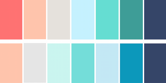
As I’ve chosen to base my Adaption A project around a mini web series, choosing the right colour scheme is very important. I need to find a collection of colours that not only compliment each other but can either apply to all the infographics as a whole or a collection of colours that could be spilt down to help define the videos.
I did some basic research using Google and Pinterest and I soon noticed a running trend. The pastel colour schemes were more pleasing to the eye and was also a reoccurring theme within many of the infographics that I watched for research at the start. The muted tonal range was also equally appealing.
Before I go any further with the decision for a colour palette, I feel that I need to have outlined both of the script and have some of the art in the process of being made. I think this will make it easier to chose a complimentary set of colours for the 2 videos.


No comments:
Post a Comment