Tuesday 29 September 2015

Abstract | Brush and Lasso | Mixed Media | Lesson 2 | Photoshop


These are the 12 thumbnails that I did today in the Photoshop lesson. We were learning to be abstract with our work and learning some of the basic brushes and tools. My 1st 6 thumbnails are from the 'abstract brush' exercise. I tried to pick the colours that reflected what I had written from the 'word stack' for Armilla. They were supposed to reflect the colours that you might find throughout the city and how the water may pool when overflowing from the "forest of pipes". I'm especially proud of number 3 because to me, I have managed to capture the perfect tonal values and haziness of bubbling water, constantly bubbling and overflowing which would be oh so perfect for those "nymphs and naiads".

My second page of thumbnails are from the "Abstract Lasso" exercise. Thumbnails 1-3 were drawn with the lasso tool, giving me complete freedom with the shapes that would be selected, whereas with thumbnails 4-6, I used the polygonal lasso tool. These gave harsher edges and reminded me more of a kaleidoscope with its sharpened edges to the colours used within.

My third set of thumbnails was from our "Mixed Media" exercise. This was made by using some of the thumbnails I had made for the other two pages and combining them and changing opacity, blending options and transforming the images. I LOVED doing this and really had a lot of fun with thumbnails 2 and 4. I think they turned out the best and I would love to just print those thumbnails and sneak them into a gallery as 'modern art'. They are by far 2 of my favourite thumbnails of the day.

I do have room for improvement and I must learn to be quicker with Photoshop using the shortcuts on the keyboard as this could save me a lot of time in my future pieces.

Master Studies | Lesson 2 | Photoshop

Here are my 'master studies' from today's Photoshop lesson. This was an exercise to help us with 'blocking out' colour in a piece. The images on the left are the original pieces, the right side is my interpretations. I think I did very well today on these considering that this was my first time working in this manner. My shading and blending skills do need work on but I think this will come with time and practise. I have learnt more about composition and successfully managed to block the colours in the right proportion as well as location and didn't 'offset' my work too much today either. This is a big improvement from my 'Still Life' exercise but I can sill see a lot of room for improvement. 

Monday 28 September 2015

Thumbnails 1-6 | Photoshop | Invisible Cities

These are the first 6 thumbnails for the city of Anastasia. They include 2 thumbnails previously uploaded. Thumbnails 1-3 are simplistic drawings with only the odd splash of colour to show depth. Thumbnails 4-6 are more in-depth, close up shots of some of the main points of Anastasia. These include the fire pit, part of the main canal structuring (as seen in the Roman Aqueducts) and at the end to one of the canals which ends where the women can be seen "bathing in the pool of a garden".

Saturday 26 September 2015

Goblets | Practise | Screenshots | Maya

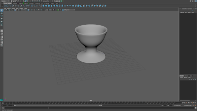
After completing the egg cup tutorial, following the video as a step-by-step guide, I wanted to test if the skills I had learnt from it had really sunk in. I decided to test myself and remake the egg cups from memory. Making goblets seemed like more of a challenge and I thought I would struggle without referring to the video.


I was so wrong! I created 4 goblets and was very pleased with the outcome. I did check with the video that I was extruding the top and bottom planes of the Poly cylinder correctly but didn't have any major problems! I definitely feel so much happier using Maya and cannot wait to try more of the tutorials and see how much I can challenge and push myself along the way!


The Cabinet of Dr. Caligari | 1920 | Film Review

Fig.1 Movie poster for the film

This is a review of the film The Cabinet of Dr. Caligari (1920) by Robert Wiene. Watching the piece, it was quite clear to see how he used the black and white tonal values to his advantage, adding shadows and curved, eccentric scenery helped to draw the viewers eyes ever deeper into the scene playing before them.

Roger Ebert also picked up on the usage of Wiene's elaborate scenery stating in his review
The actors inhabit a jagged landscape of sharp angles and tilted walls and windows, staircases climbing crazy diagonals, trees with spiky leaves, grass that looks like knives. These radical distortions immediately set the film apart from all earlier ones, which were based on the camera's innate tendency to record reality. 
(Roger Ebert - 3 June 2009)
Ebert is certainly right on saying how the scenery sets this film apart from its earlier counterparts. The obscured view and look of the scenery was something rarely seen before the films debut and has helped dramatically with horrors that we see today. It has caused massive influence through the consequential years with its dramatic use of tone; either with shadowing, often leaving parts of the set completely shrouded in darkness, to give a sense of mystery and fear. It can also be argued that Wiene used German expressionism to darken the air around the scenes and also pushed it further with his use of usually thick makeup on characters for added effect. This is also backed up by the fact that Germany was going through a very morose period in time due to the recent conclusion of World War 1 in 1918.

This oddly intriguing film is dark and mysterious and full of hidden gems and leaves the viewer wondering just what happened in that small town of Holstenwall. Wiene opened the film with the yet unnamed Francis talking to a man besides him about the spirits all around before his 'fiancĂ©' makes her first appearance. You may argue that this garden is one of our few glimpses of reality before the film takes hold because before long, Francis transports us into a distorted world. Ebert picked up on this and it definitely drags the eye across the set and scene in wonder at the beautifully playful architecture. It is possible to perceive this set as a distortion of the memories that we as an audience are trapped within the darkest corners of Francis' mind or perhaps Wiene is telling us something more? Is all as it seems?

Fig.2 Dr Caligari and Ceasre with Jane looking on

Our main character appear to be Francis and his once close friend Alan, who both fall for the beautiful Jane before Dr. Caligari visits the town and applies for a spot in the fair so he can show of his amazing Somnambulist.

Due to the films age, the speech is lost to us unless we can read the tantalizingly twisted words displayed to us but so much more is conveyed with the theatrical acting and emotions. The way they act and hold themselves seems almost comical to the viewer in this day and age but certainly helps twist the story even more. One character that so much is based around and seen is Cesare, the Somnambulist, with eyes darkened by makeup, black clothing and lack of words that come forth from his mouth. Just the way he stands conveys that he may not be so innocent as he first seems. Even Dr Caligari himself is covered in this over the top theatrical makeup, disfiguring the shaping of the face, head and hands. Maybe this was some cleaver foreshadowing by Wiene.

Towards the end of Francis's re-telling of the horrors of Dr. Caligari, as an audience, we could argue that we are brought back to reality or at least out of his distorted reality before seeing his beloved Jane, whom believes she is a Queen, Cesare, a quiet character in the corner and the 'real Dr. Caligari'. As we find out, the place he seems to be held within is a mental asylum allowing us to question the sanity and credibility of Francis's retelling. Was it all true? Which parts are reality and which is faux?

In conclusion, we can owe a lot to The Cabinet of Dr. Caligari, for the influence it has made and helped shape horror into what we ourselves see on our screens today. It is definitely a great example of German expressionism and it definitely left us, the audience, questioning the film and wanting more...


Bibliography
Quotes
http://www.rogerebert.com/reviews/great-movie-the-cabinet-of-dr-caligari-1920

Imagery
http://orangeshow.org/events/140/
https://upload.wikimedia.org/wikipedia/en/3/35/Das-Cabinet-des-Dr-Caligari-poster.jpg

Thursday 24 September 2015

Thumbnails 1 & 2 | Photoshop | Invisible Cities


These are my first two thumbnails for the work on the Invisible Cities project. They are parts of Anastasia and represent the fire pit and part of the canal system ending into where I would imagine that the women of the city can be "seen bathing in the pool of a garden".

After my last attempt in Photoshop, I decided not to follow a realistic approach to it, especially in the thumbnails so early on and instead, allowing my own cartoonist style to flow freely. I felt that my style complimented Anastasia well, as it creates a alluring sense of desire to find out more about this hidden power within its walls.

What I haven't shown in the thumbnails here is the "concentric" canals; merely the end piece to the system. For these, I plan to research into the aqueducts of ancient Rome before adding my own flair and curving them around the city and its walls. These images will be included in my Influence Map for Anastasia. Once my thumbnails are complete I shall arrange them and number them clearly.

Wednesday 23 September 2015

1st Maya Tutorial | Goblets | Complete | Screenshots | Maya

Here is a screenshot of my final 4 egg cups from the 1st online Maya Tutorial. Despite struggling for a bit, I'm still very proud of my ability to complete the task and I have learnt so much along the way. 
It shows the polygon eggcup completed with the SUBD and poly smooth egg cups along side. 
If I have some free time, I think I may create some of my own objects using these techniques to ensure that I completely understand everything that I have learnt during this tutorial. 

1st Maya Tutorial | Goblets | WIP | Screenshots | Maya

This is a screen shot of my work so far on the 1st online Maya tutorial. I think I've done really well and have improved massively on the NURBs egg cup and really refined the shape down. The shape is really smooth and refined compared to my last attempt and I do have more of a straightened edge to the first. Using NURBs was a lot easier today as what I had learnt in lesson had sunk in and taken effect. I'm also beginning to understand the process a lot more as well as remembering where buttons are in the menus and which arrow keys to use.

I'm part way through creating the 2nd egg cup using the polygon method and so far, I feel very happy with my work. I've had a few hiccups due to using the wrong arrow tool and was redefining just one plane of the stem and not the whole outer edge. I understand this mistake and now I've corrected myself, I feel a lot more confident with the program.

First Maya Lesson | Egg Cups | Screenshots | Maya


These screenshots are from my first Maya lesson. The top image shows my first model ever. This was my attempt at creating an egg cup during class. The image below was me manipulating it to make it into a birdbath so I could get used to using the tools and arrows to move parts. I think I did a good job for my first ever model but I will remake the egg cup when doing the online tutorial for the introduction to Maya.

Monday 21 September 2015

First Digital Paintings | Lesson 1 | Still Life | Photoshop


These are the first ever digital drawings I have done on the tablet using photoshop. They were done in class and I can see that there is a lot of room for improvement. This was also the first time that I used the Intuos Pro tablet to do drawings with rather than my older Wacom Bamboo. I will have to practise a lot more with the brushes and shortcuts.
I'm going to try and push myself to do some extra drawings every week on photoshop outside of class if I have some spare time, so I can gain more experience and knowledge of brush sizes, colours, blending and positioning.

Sunday 20 September 2015

Text and Sketches | Invisible Cities


Now I've read through all of the text provided on the cities, I've began to revisit each and highlight pieces of text that provide information about them. I didn't understand some of the words so I found their meanings in the dictionary and have written them down before sketching some small images that have jumped to mind, either due to the text or to help me understand the text further. These are just quick images done with pencil and sharpies for bright colours.

Perspective Drawings Practice | Photoshop | Invisible Cities


This is my first attempt at drawing digitally with the new graphics tablet. Some of the angles are off, making it look like these houses are on a hill. So I thought I'd draw in pencil and ink.

This is much better. There is still some angling issues but I have started remembering my DT: Graphics lessons. This was only a quick sketch but I'm already starting to get back into the flow of adding perspective into drawings.

Friday 18 September 2015

Walt Disney Studios: Behind the Scenes | Video


Growing up, I was involve with the Walt Disney Studios: Behind the Scenes that were always aired on TV.  Here's a clip about Post Production within Disney.

Thumbnails 42-47 | Summer Project

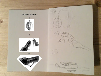
More time sketches here! quick sketch of an old rustic lamp by using the broach. The heels are a lot harder to incorporate with ideas and sketches. I used the angle of them to create a bridge before using the main body of the shoe for a row boat. As a little added extra feature, I made the oar out of the heel.

These three thumbnails could be used to combine into one character. The King. His crown made from the vase to create a piece of glory. His 'fur cape' made from the shaping of the seed, to add royal stature and the sceptre from the vase, adorned with gemstones. All in all, he's one pretty fancy king.

Thursday 17 September 2015

Thumbnails 37-41 | Summer Project

Thumbnails 37 and 38 were quick time trial pieces. Not really too fond of them but they only took about 2 minutes each. Rough and quick but they still convey the ideas across.

39-41 were created by rotating and combing some of the images. I printed off the summer project and sat rotating the paper slowly looking for a new direction in which to take an object. The wings are really nice to replicate and look create side by side as well as overlapping each other slightly. 41 required bending the object slightly to create a waterslide. This was only a quick sketch as I was suddenly flooded with new ideas!

Wednesday 16 September 2015

Thumbnails 34-36 | Summer Project

Three more life forms. Not really combining objects together here as this was a 10minute challenge I set myself. I chose 3 objects as starting points and wanted to create 3 separate characters by rotating the objects and looking at them from a new angle. It created a goose, 'plant-pot robot' and an owl. Although they are not that intricate, they are simple line drawings and could easily be modelled into fully functioning characters. I think this was a great challenge to set myself and should set challenges like this for myself more often.

Thumbnails 31-33 | Summer Project

More animal thumbnails! This time an owl from the seed because the marking just screamed out eyes and a beak! I did move the position a little bit just to fit his shape a little better. His bat friend on the tree with him was made from the broach. They also befriended the little glow worm on the floor. They all like to sit up at night and chat by the light of the glow worm.

Thumbnails 27-30 | Summer Project

Animal design! After my character design a few thumbnails back, I thought it would be best to explore animals of the lifeforms. This allowed me to create an anglerfish from the broach, a glow bug using the lightbulb, a cartoonistic bumble bee from the fly hooks and a cute bunny using them too. All of these thumbnails relied on a cartoon angle to allow a flowing theme.

Thumbnails 24-26 | Summer Project


A continuation on from weaponry here, this time experimenting with some different objects. The heels were a nice piece to experiment with by using the main body as a decorative casing for the weapon. The machine part was perfect to rotate and create a land based missile launcher. Simple yet effective in my eyes and last but not least, using the lighting rig as a futuristic, handheld missile launcher helped with the starring of the piece and framework.

Thumbnails 19-23 | Summer Project

Welcome to weaponry! I recently went to Europe's largest steampunk exhibition in Lincoln so I had the wacky clarinet guns, contraptions and creations on the brain and began sketching a few futuristic ray guns! As much as I'd love to see these being fully functioning pieces, I'm not so convinced that the vase will allow the gun to fire straight. Some of them seem a little stumpy, almost like they are 'sawn-offs'. This I'm not so fond of so I might combine some more of the objects together to make a 'decent' sized gun.

Sunday 13 September 2015

Thumbnails 16-18 | Summer Project

Bit of a different take on flying this time! I used what I believe to be some kind of valve to create a futuristic fighter jet. I flattened the end connections and cut the wings short to give it a smaller, compact war feel for 16; whereas for 17 I made the 'cut off point' into the engine housing for the wings. I also chose to look down onto the plane and gave it a spitfire vibe.
18 became a jackhammer. How did I come up with this? I have no idea. I did want a third plane but realised that a simplistic approach provided machinery from another perspective.

Thumbnails 13-15 | Summer Project

Cute animals this time just using the seed? It looked like a reindeer to me when upside down and a ducks beak before turning it the right way around to make a little baby bird. Most of the 'facial features' on them did come from the colouring and detail on the original piece. My pieces are very cartoon like so this is something I may need to think about changing and opting for a more realistic take.

Thumbnails 9-12 | Summer Project

Airspace and flying!
I got a bit carried away with different machines and methods which people have used to travel by air and the seed? was a perfect object to use! It looked extremely aerodynamic already and could be manipulated easily without changing too much of the structure. This allowed me to created a hot air balloon, a zeppelin/blimp, parachute and a rocket ship (this was definitely not inspired by me watching the Wallace and Gromit short animations while drawing...)

Thumbnails 6-8 | Summer Project

After doing a few faces, I thought I should experiment a little with some creatures. These 3 were made using the same piece and rotating or flipping the image to create different life forms. The elephant and the mouse like creatures had the same starting point for the ears. For thumbnail 8 it was used to give the penguin a chubby body to give the impression he's only a baby.

Thumbnails 2-5 | Summer Project

I love changing the perspective on pieces and just making quick little cartoon-like sketches so the Canadian, Racing Driver, Cold Man and Ninja were born! This was more like a costume change page. It was fun to do and allowed ideas to be drawn quickly and cleanly. These were time trial pieces  so I only gave myself a maximum of 3 minutes for each piece.

Thumbnail 1 | Summer Project


This is my first thumbnail. I'll be editing the images before I upload them to show the inspiration for each piece besides them. This 1st piece is an octopus inspired by a steampunk exhibition that I went to over the summer.

  • What is Steampunk? Just google it. You'll fall in love with it. 
  • How is an Octopus Steampunk? I have no idea...

New Year @ Uni - New Blog!

Right! Let's do this! :D
I'm just starting CAA and I'm so ready for this! I can see myself battling with this blog late into the night as I'm just so not used to Blogger but here goes! I'm Beckie, I've loved animation since I was very little and my dream is to one day work for Pixar. It's been that way for as long as I can remember and this is me trying to achieve that dream!
I've just moved back into the halls so I'll be uploading all of my Summer Project Work if the internet doesn't conk out! :D